Common Sense Isn’t Always Common Fact
A few weeks ago, someone told me a “common sense fact”: the more reviews a podcast has, the higher it ranks on the charts. It sounds right. It feels right. It gets repeated at conferences, in marketing meetings, and on podcasts themselves as if it were a law of physics.
I had two reactions.
As a category designer, I reject the premise. The most dangerous phrase in any market is “everybody knows.” Category designers don’t inherit assumptions. We test them, and when they fail, we replace them with better language and better thinking.
As an engineer, I want to see the data. I spent my Navy years running nuclear power plants on aircraft carriers. In that world, “it sounds right” gets people killed. You trust instruments, not instincts. So instead of nodding along, we ran the study.
Just because someone calls something a fact doesn’t make it a fact. This report, the first in a four-part series, is what the instruments actually say.
The Myth We Tested
“Top podcasts have a lot of Apple reviews. Reviews drive rankings.” If that’s true, chart position and review count should rise and fall together. The #1 show should have more reviews than the #100 show, which should have more than #200. The correlation should be strong and obvious.
It isn’t. It barely exists at all.
How We Ran the Study
On June 11-12, 2026, we captured the complete Apple Podcasts U.S. Top 200 charts for the two categories Interview Valet serves: Business and Health & Fitness. That is 400 shows in total. For every show we recorded its chart rank, its lifetime Apple rating count, and its average star rating, all from Apple’s own public pages, all on the same day. We then ran a Spearman rank correlation, the standard statistical test for “do these two lists move together?” A result near 1.0 means reviews and rank march in lockstep. A result near zero means knowing one tells you nothing about the other. Full methodology and the complete 400-show dataset are in the appendices.
Finding #1: The #1 Business Show Has 457 Reviews
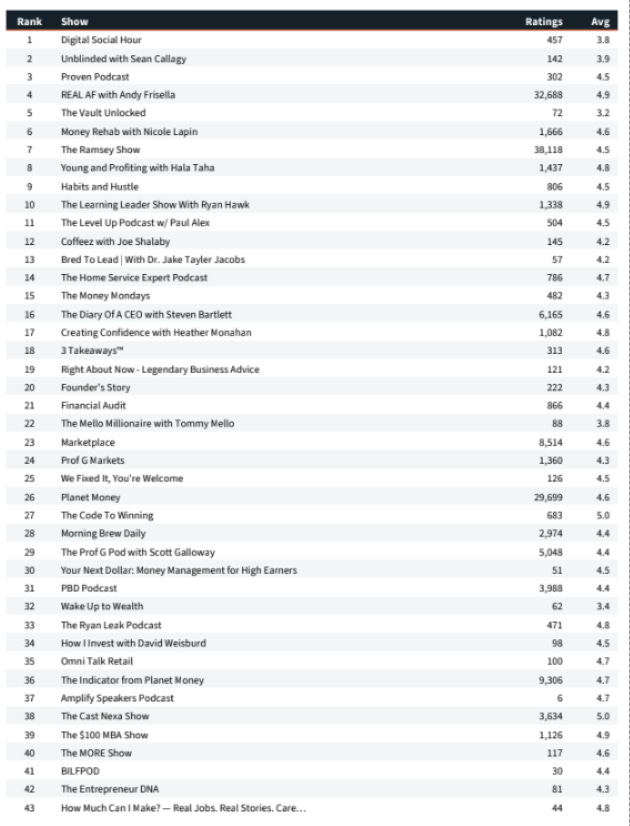
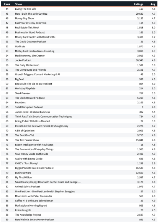
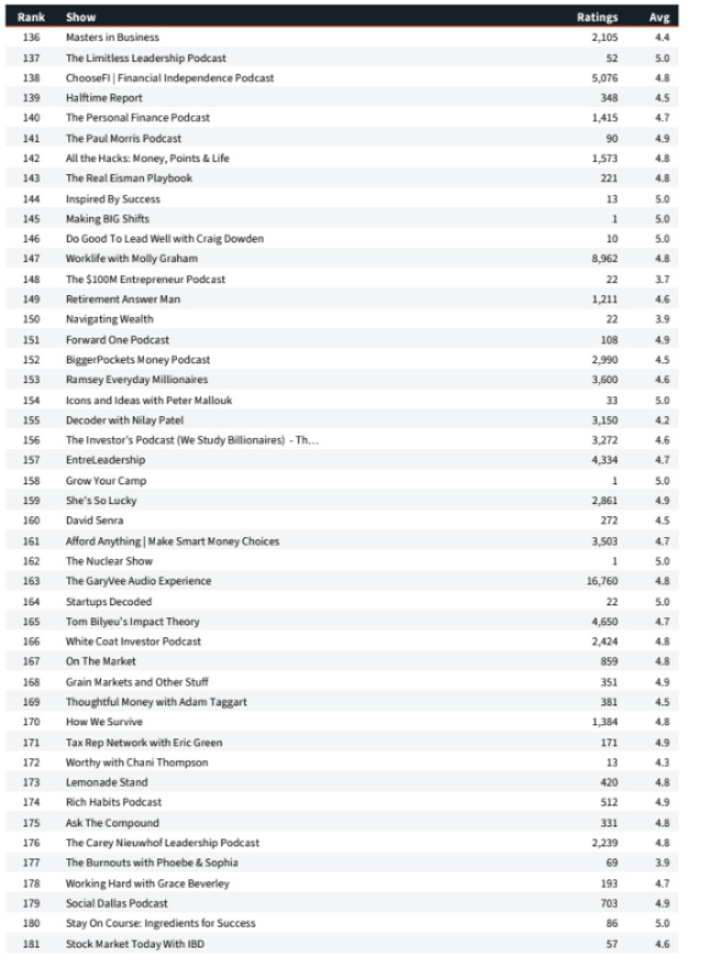
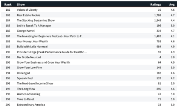
On the day of the snapshot, the #1 business podcast in America had 457 ratings and a 3.8-star average. The #5 show had 72 ratings. Meanwhile, The GaryVee Audio Experience (16,760 ratings) sat at #163, and The Ramsey Show, with roughly 119,000 ratings, wasn’t #1 either.
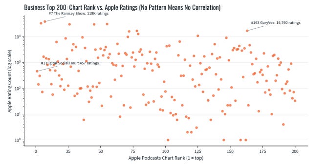
Each dot is one of the top 200 business shows. If the myth were true, the dots would slope down from upper-left to lower-right. They don’t. They’re a cloud.
Correlation between chart rank and review count: ρ = 0.18. Review counts explain about 3% of chart position. The other 97% is something else.
Median top-200 business show: 485 lifetime ratings. Not thousands. Hundreds.
62 of the 200 shows (31%) have fewer than 100 ratings. Half have fewer than 500.
Shows ranked 51-100 actually have a higher median rating count than shows ranked 1-50 (908 vs. 493). The “top of the chart” does not mean “most reviewed.”
Finding #2: Health & Fitness. Same Myth, Same Result
One category could be a fluke. So we ran the identical study on Health & Fitness. The myth failed again, and failed harder.
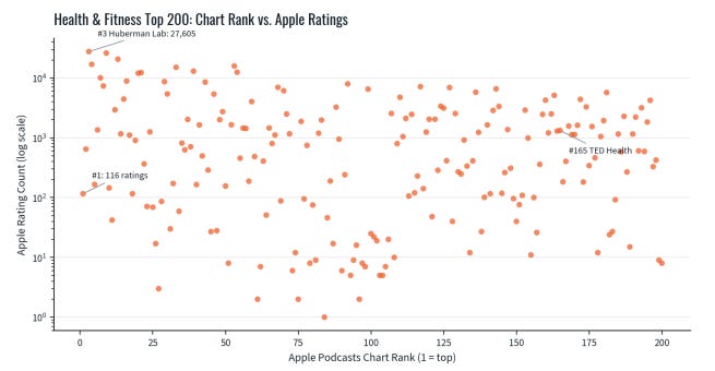
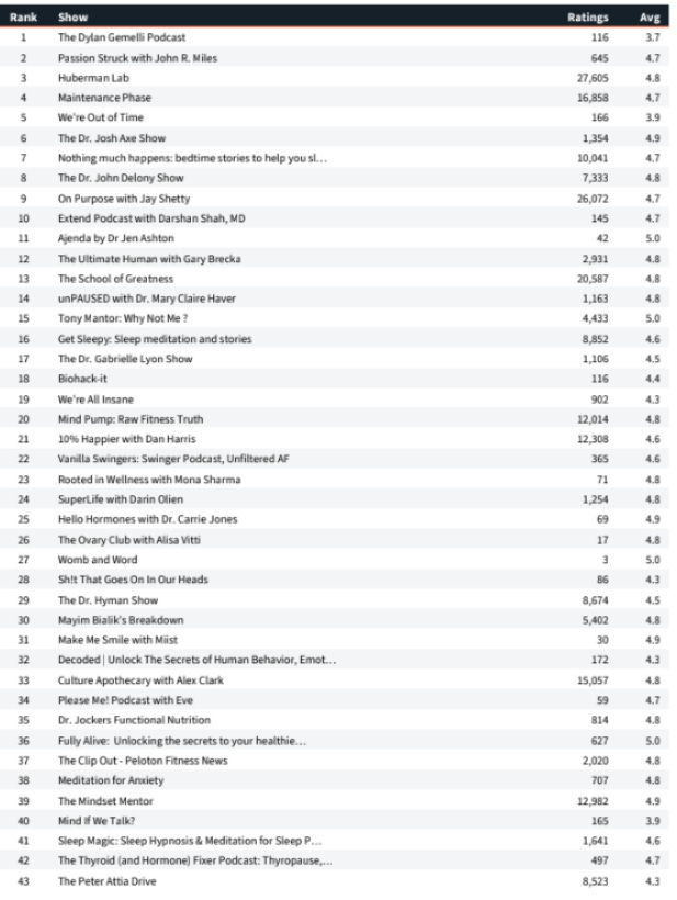
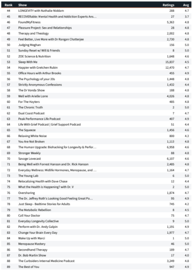
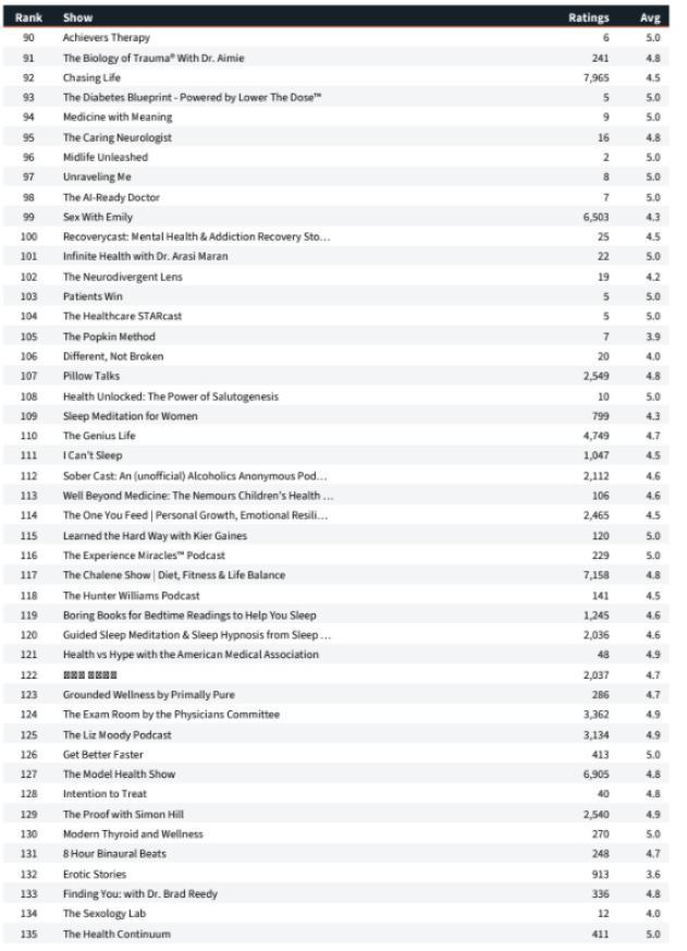
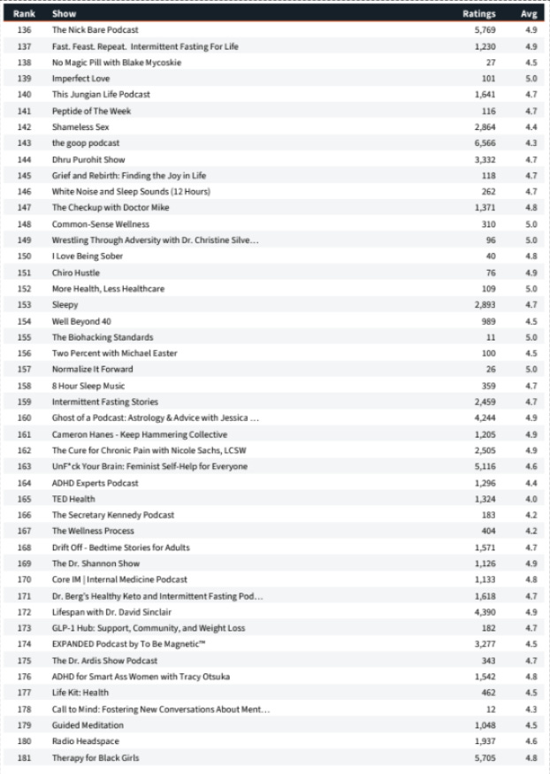
Health & Fitness top 200: the #1 show had 116 ratings. Huberman Lab (27,605 ratings) sat at #3. TED Health sat at #165.
Correlation: ρ = 0.08. Review counts explain less than 1% of chart position in this category.
The #1 health podcast had 116 ratings and a 3.7-star average on snapshot day.
Median top-200 health show: 598 ratings. 56 shows (28%) have fewer than 100.
Across both verticals (400 shows), not one statistical test supported the myth.
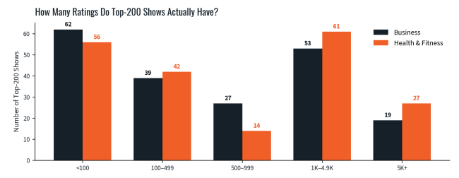
The reality of the top 200 in both categories: small review counts dominate. Five-figure review counts are the rare exception, not the price of admission.
Why the Myth Feels True (and Why It Isn’t)
Here’s the honest engineering note. Review counts are cumulative: a 12-year-old show has had 12 years to collect them. Apple’s charts measure something different. They track recent momentum: new follows and engagement over the last few days. The myth confuses a show’s odometer with its speedometer. A show can be famous and slow, or unknown and accelerating. The chart rewards acceleration.
That’s why both things you see on the charts are true at once: legacy giants with six-figure review counts sitting at #150, and shows with 72 reviews holding top-10 spots. Reviews measure accumulated fame. Charts measure current motion. They are different instruments measuring different things, and using one to predict the other is how “common sense” quietly becomes commonly wrong.
What This Means for You
If you judge podcasts by review counts, you’re reading the wrong gauge. A show’s review total tells you how long it’s been collecting, not how alive its audience is today.
If you’re a guest, stop chasing vanity metrics. Some of the most valuable shows for reaching your ideal customers have a few hundred reviews and an audience that hangs on every word.
If you host a show, you don’t need thousands of reviews to chart. 31% of top-200 business shows have fewer than 100. The bar you imagined isn’t the real bar.
Demand data, not folklore. If someone tells you a “common sense fact” about podcasting, ask them to show you the numbers. We just did.
Questions to Ask Yourself
When was the last time you left a review on Apple Podcasts?
Do you even listen on Apple Podcasts?
How many of the reviews you see do you think are bots?
And here is the part that should end the debate: you don’t have to take our math for it. Apple itself has publicly confirmed that ratings, reviews, and shares “are not factored into the algorithm” that ranks Top Shows. The company that builds the chart says reviews don’t move it. The data above simply proves Apple is telling the truth.
“Today, asking for a rating review on your podcast is a desperate cry for help.”
Sound Education Podcast Conference, Harvard University, 2019
Next in the Series
Report #2: “Top podcasts have huge YouTube followings.” Spoiler: the #2 business podcast in America has 98 YouTube subscribers, and 10 top-200 shows have no YouTube channel at all. Same charts. Same instruments. Same week-from-now release.
Appendix below.
Talk With Me About This Report
Chat or talk with my AI.
I trained a bot on my thinking, my frameworks, and this research. Ask it anything about this report, your own rubric, or Podcast Interview Marketing.
Work with an agency that runs the math.
If you want podcast introductions chosen on data and audience fit instead of common sense myths, book a discovery call.

Tom Schwab is the founder and Chief Evangelist Officer of Interview Valet, the first and longest-running podcast interview marketing agency. He is the author of Podcast Guest Profits: Grow Your Business with the Targeted Interview Strategy and the recent mini-book From Megaphone to Magnet: The HOW for Creator Capitalists. A U.S. Navy veteran who ran nuclear power plants on aircraft carriers, Tom has spent his career insisting that decisions be made on instruments, not instincts. He lives in southwest Michigan with his wife Karen.
Methodology & Limitations
Charts. Apple Podcasts U.S. “Top Shows” charts, Business (genre 1321) captured June 11, 2026, and Health & Fitness (genre 1512) captured June 12, 2026, via Apple’s public top-podcasts feed, 200 shows per category.
Ratings. Lifetime U.S. rating count and average star rating collected the same day from each show’s public Apple Podcasts page. All 400 shows captured; no sampling.
Statistics. Spearman rank correlation between chart position and rating count. Business: ρ = 0.18 (r² ≈ 0.03). Health & Fitness: ρ = 0.08 (r² ≈ 0.006). In plain English: review counts explain roughly 3% and under 1% of chart position, respectively.
Limitations. (1) Ratings are lifetime-cumulative while charts reflect recent momentum, so even a true causal link would be diluted. But a real “reviews drive rank” effect would still produce a far stronger correlation than observed. (2) U.S. storefront only; counts vary by country. (3) Single-day snapshot; Apple’s charts move daily, which is precisely the point. (4) Apple does not publish its ranking algorithm; this study tests the folk claim, not Apple’s internals.
Reproducibility. The complete dataset (every show, rank, rating count, and star average) follows in Appendices A and B. Check our work. That’s the whole idea.
Appendix
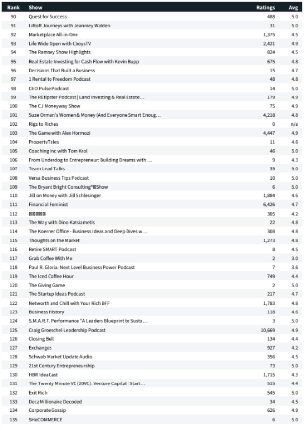
Appendix A: Business Top 200 (June 11, 2026)
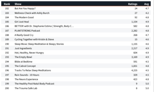
Appendix B: Health & Fitness Top 200 (June 12, 2026)